Best Weapons for Farming Dark Matter Camo Fast
I noticed something strange while scrolling through tournament brackets last month. Almost every team looked the same. Sharp angles everywhere. Neon gradients bleeding into black backgrounds. A wolf or a dragon lurking in almost every crest. It felt less like original art and more like a factory line.
You would think designers have endless creative freedom. But they do not. Budget constraints squeeze them into corners. Sponsors demand instant recognition over long-term brand value. And players just want something that looks cool on a jersey.
Why Generic Designs Win Short-Term but Lose Long-Term
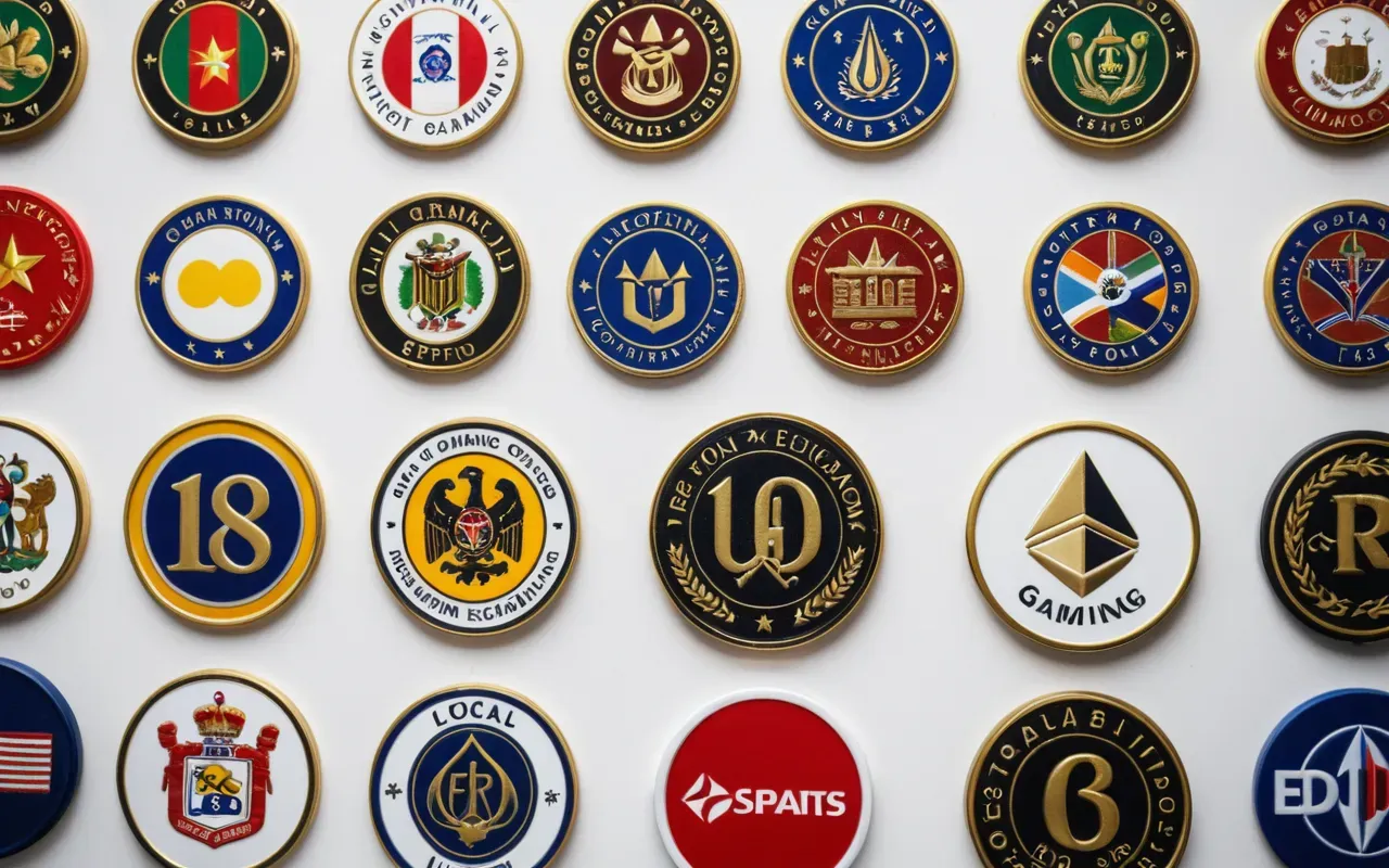
A quick logo gets you onto a tournament roster fast. That is undeniable. But it also makes your team invisible after the event ends. Fans cannot remember what they saw yesterday if everything shares the same visual language.
Think of it like wearing a costume that matches everyone else at the party. Sure you fit in initially. But nobody remembers your face afterward. In esports recognition is currency. If your logo blends into the noise then sponsors will eventually look elsewhere.
The Hidden Cost of Template Logos
Template packs sell for roughly twenty dollars online. That sounds like a steal until you realize every other startup team bought the same pack last week. Suddenly your unique brand becomes one of hundreds wearing identical armor.
And that is only the surface problem. Those pre-made assets rarely scale well across different formats. They blur on small mobile screens. They lose contrast in dark overlays during live streams. The visual identity crumbles under real-world usage conditions.
What Makes a Logo Actually Stick With Fans
I have watched teams rise and fall over three seasons. The ones that stayed relevant shared one trait above all else. Their logo told a story without needing words to explain it.
Take the color palette for example. Successful organizations usually stick to two or three primary colors maximum. That restraint forces designers to rely on shape and contrast instead of rainbow gradients that look chaotic after a few hours.
Typography matters more than most people realize. A bold sans-serif font cuts through broadcast overlays beautifully. Thin decorative scripts disappear the moment commentary graphics appear on screen.
The Psychology Behind Iconic Gaming Symbols
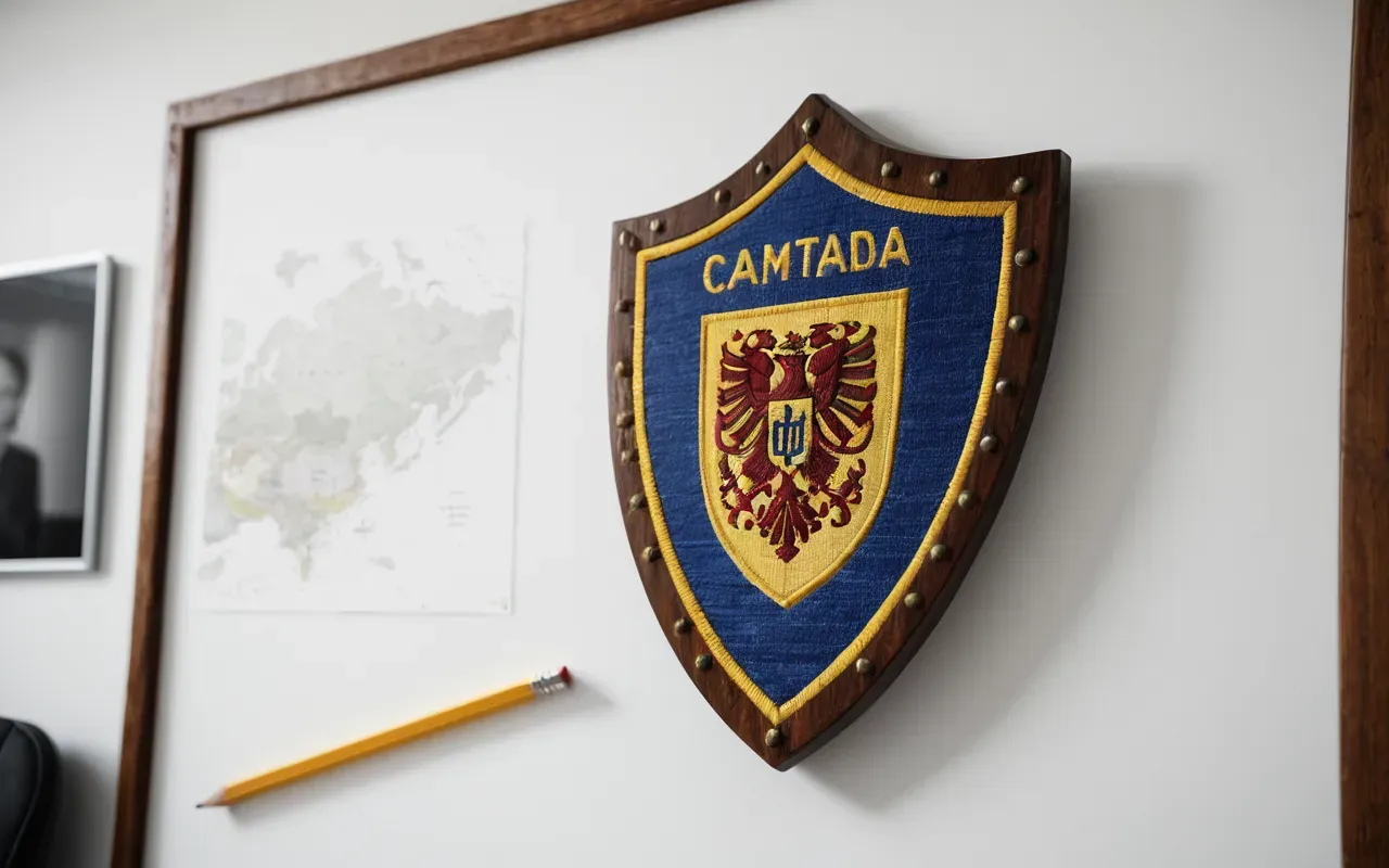
Humans process shapes faster than text. That is why circular shields and sharp chevrons dominate competitive gaming aesthetics. They signal strength instantly without requiring conscious thought from the viewer.
But shape alone does not guarantee loyalty. Context matters just as much. A simple geometric mark becomes iconic when paired consistently with player personalities and memorable tournament moments.
How Contrast Creates Instant Recognition
Light against dark works every single time. That is not just an opinion backed by art history either. Broadcast environments are notoriously harsh on weak color combinations.
Test your draft against a gray screen background before finalizing anything. If the edges start disappearing then you know the contrast failed under real conditions.
When Simplicity Beats Complexity Every Time
Overcomplicated crests look amazing on a large banner at first glance. But zoom out to thumbnail size and all that detail turns into an unrecognizable blob.
Fewer elements mean faster loading times on stream overlays too. Technical performance matters alongside aesthetic appeal in live production environments.
Why Negative Space Wins More Than You Expect
Empty areas around your mark do their own heavy lifting. They give the eye somewhere to rest while still framing the central shape effectively.
Crowded compositions overwhelm casual viewers who scroll quickly through sponsor decks. Clean layouts respect attention spans and reward them with clarity instead.
How to Spot Bad Design Before It Launches
You do not need a degree in graphic design to notice problems early. A few quick checks save thousands of dollars down the road when rebrands become necessary.
Start by squinting at the screen until shapes blur together. If you cannot tell what symbol represents your team then contrast failed somewhere along the way.
The Font Trap Most New Teams Fall Into
Free font sites tempt designers with exotic looking characters that break completely when exported to vector formats. Legibility dies instantly after those conversions happen.
Stick with widely supported typefaces until budget allows custom lettering development. Consistency beats novelty when it comes to building long-term recognition across platforms.
Color Consistency Across All Touchpoints Matters
Pick exact hex codes upfront and lock them into documentation immediately. Variations creep in later when different departments order merchandise independently without checking standards first.
Merchandise printers shift colors based on fabric type and dye batches. Providing precise Pantone references alongside digital codes prevents embarrassing mismatches at launch events.
Building Identity Around Actual Player Culture
Logos stop feeling generic when they reflect real team history instead of chasing trends. Inside jokes become visual motifs that resonate deeply with core supporters.
Research how fans actually interact with your organization online. Meme references often reveal stronger emotional connections than polished corporate messaging ever could.
Why Regional Identity Adds Unexpected Depth
Teams rooted in specific cities or neighborhoods develop instant loyalty from local supporters. Subtle nods to regional architecture or natural landmarks create stories worth sharing.
That authenticity translates directly into merchandise sales too. Fans proudly wear symbols representing their own communities alongside favorite players.
Collaboration Beats Isolation During Concept Development
Designers working alone miss crucial perspectives that players bring to the table. Involve roster members early in sketch sessions before finalizing any direction.
Players understand tournament environments better than external creatives usually do. Their feedback prevents embarrassing visibility issues during live broadcasts later on.
Real Examples That Prove Simplicity Works
Look at organizations dominating sponsor deals right now. Their marks share surprisingly few decorative elements despite competing in completely different regions.
One uses a single bold letter combined with aggressive negative space cuts. Another relies entirely on geometric contrast without adding mascot figures whatsoever.
The Evolution Path From Amateur To Professional Markings
Most successful teams go through multiple iterations before landing on final versions. Each revision removes unnecessary complexity while strengthening core shapes.
Patience pays dividends here because rushing leads to regrets later when scaling issues emerge across new platforms.
Budget Realities Versus Creative Ambition Balance Points
Freelancers charge anywhere from five hundred to ten thousand dollars depending on experience levels and deliverable scopes. Set clear expectations upfront to avoid surprise invoices later.
Mid-range designers often deliver better value than expensive agencies for growing organizations. Focus on portfolio evidence rather than hourly rates when making hiring decisions.
Frequently Asked Questions
How long does it take to design a proper gaming esports logo?
A quality logo process usually takes three to six weeks from initial sketches through final vector delivery. Rushed projects under two weeks often skip crucial testing phases that cause visibility problems later.
Can I reuse an old logo if my team rebrands later?
Yes but only if the core shape remains recognizable after adjustments. Successful rebrands keep foundational geometry while updating colors and typography to match current trends.
Why do some logos look great online but terrible printed?
Digital files often rely on RGB color modes that shift dramatically when converted to CMYK printing standards. Always request vector source files with embedded Pantone references for accurate physical reproduction.
What budget range should new teams expect for professional design?
Freelance designers typically charge between eight hundred and three thousand dollars for complete identity packages including multiple format exports. Lower prices usually indicate template reuse rather than custom work.
How often should established teams consider updating their marks?
Major overhauls every five to seven years maintain relevance without confusing loyal supporters. Minor tweaks can happen annually for seasonal content while preserving core recognition elements permanently.
For the full overview, see efficient skin unlocking methods.
Related in this series: modern warfare 3 gold camo challenges.