How to Get Gold Camo in Modern Warfare 3
Look at the top tier teams in major shooters right now. They all look identical. Sharp geometric beasts, aggressive serifs, neon gradients bleeding into dark backgrounds. It is a sea of sameness that confuses fans and frustrates sponsors alike.
I noticed this trend accelerating around late two thousand twenty four. Designers started copying what worked for a few early adopters rather than building something fresh. The result is a visual landscape where half the logos could belong to any organization.
And here's the thing. A logo is not just a pretty picture for your stream overlay. It is the anchor of your entire brand strategy in esports. When fans cannot distinguish you from three other teams, they stop caring who wins.
We need to talk about why this happens. It is not laziness alone. The pressure to look professional pushes newcomers toward safe templates. But safety kills recognition in a market saturated with visual noise.

Why Templates Kill Brand Recognition Fast
Template libraries make it easy to slap together a mark in ten minutes. You pick an animal, add some speed lines, choose red and black, and boom you have a brand identity on paper.
But look closer at those designs. They lack narrative depth. There is no story behind why that specific creature was chosen or how the color palette connects to your team's actual playstyle.
Sponsors see through this instantly. They want distinctiveness because their money buys attention in a crowded arena. If your mark blends into the background of tournament broadcasts, you lose value overnight.
The Psychology Behind Generic Design Choices
Human brains crave novelty but fear risk. New teams mimic successful organizations hoping to inherit some of their credibility by association.
This is a cognitive trap. Copying visuals signals insecurity rather than strength. Fans pick up on that subtle lack of confidence even if they cannot articulate why your brand feels hollow.
Real identity comes from embracing what makes you different. Maybe your team specializes in slow methodical tactical play rather than aggressive rushes. Your logo should reflect that deliberate nature instead of screaming chaos.
Building A Distinctive Visual Identity From Scratch
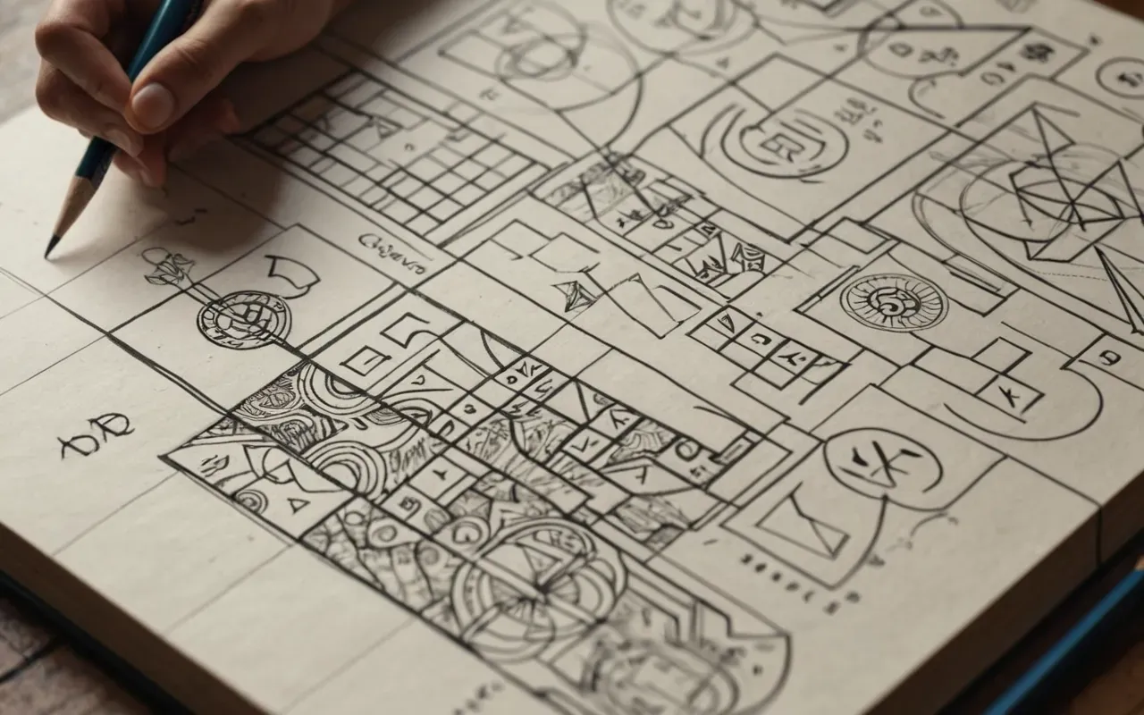
Start by stripping away everything you think you must include. Forget the dragons for now. Ignore the jagged edges that every design tutorial pushes as mandatory elements of aggression.
Ask yourself what your organization actually stands for on the battlefield. Are you known for clutch moments under extreme pressure? Do your players communicate with unusual clarity during chaotic engagements?
Translate those strengths into visual metaphors. A shield might represent defensive mastery better than a roaring wolf would for a squad that excels at holding angles in tactical shooters.
Then refine the execution. Clean lines beat clutter every time because they scale down beautifully for mobile app icons and merch patches without losing legibility.
Color Theory Applications For Competitive Environments
Colors carry heavy psychological weight in gaming spaces. Red screams urgency and danger while blue conveys trust and stability depending on how you apply them.
Most organizations overuse red because it feels exciting. But constant exposure to high saturation tones causes visual fatigue for viewers watching long tournaments.
Try stepping outside the standard red black white combination. Deep teals paired with metallic silver create a sophisticated look that separates you from the loud competition without sacrificing intensity.
Test your palette across different mediums early. What looks vibrant on a high end monitor might wash out completely when printed cheaply onto fabric for player jerseys.
Typography Choices That Command Attention Quickly
Fonts are often an afterthought in amateur branding projects. Yet the right typeface can instantly elevate a simple geometric mark into something memorable.
Custom lettering offers the highest level of exclusivity. Even minor modifications to standard characters prevent your mark from looking like another template derivative.
Legibility remains non negotiable during fast paced broadcasts. If commentators cannot read your team name instantly when it flashes on screen, you have failed the primary function of branding.
Balance uniqueness with readability. Aggressive slants and broken letters add personality but too much distortion turns text into illegible scribbles that confuse audiences entirely.
Adapting Visual Marks Across Digital Platforms Effectively
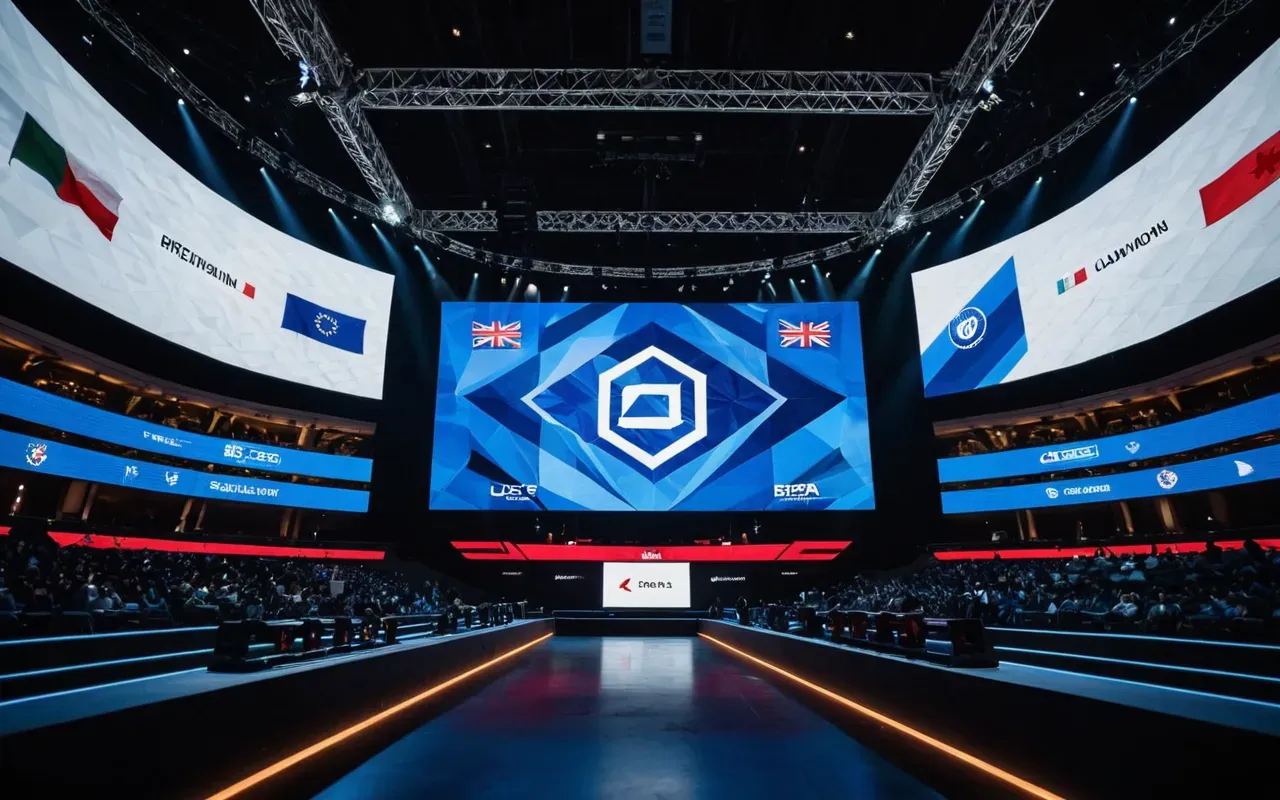
Your logo lives in many places simultaneously these days. Stream overlays require different proportions than social media avatars which again differ from large stage banners at live events.
Design systems solve this fragmentation problem elegantly. Create primary marks alongside secondary wordmarks and simplified icons that retain core identity traits while adapting to format constraints.
Consider how your mark performs in monochrome situations too. Some broadcast overlays force dark backgrounds where full color logos disappear into the noise without proper contrast adjustments.
Test every variation rigorously before finalizing your brand guidelines. Small inconsistencies compound over time and dilute recognition across fragmented digital touchpoints.
Maintaining Consistency While Evolving With Trends
Brands must evolve or die in this industry. Sticking rigidly to an outdated mark signals stagnation while changing everything every season confuses loyal supporters.
Successful organizations update incrementally. They tweak gradients or refine line weights rather than abandoning recognizable elements that fans have grown attached to over years of exposure.
Document your design decisions thoroughly. Future designers need context about why certain shapes or colors matter to avoid accidentally stripping away meaningful heritage during refreshes.
Keep an eye on emerging visual trends but filter them through your established identity lens. Adopt only those elements that genuinely enhance rather than contradict your core message.
Measuring Brand Recognition Through Fan Engagement Metrics
How do you know if your new mark actually works? Track engagement rates across social channels immediately following a rebrand launch compared to previous periods.
Monitor comment sentiment closely too. Confusion usually shows up as questions asking if the organization changed names or merged with another group unexpectedly.
Merchandise sales provide concrete financial feedback. Clear recognizable designs sell faster because fans want to wear symbols they understand and feel proud representing publicly.
Use these data points objectively. If metrics drop sharply after visual changes, pause and reassess before pushing further into unfamiliar territory.
Avoiding Common Pitfalls In Competitive Logo Design
Complexity kills scalability. Intricate details that look impressive at full resolution vanish completely when shrunk to thumbnail size on mobile devices.
Over reliance on effects creates fragile identities. Glows and drop shadows might pop online but fail miserably in physical printing environments where ink limitations apply strictly.
Ignoring cultural context backfires globally. Symbols that seem harmless locally might carry offensive meanings in other regions where international tournaments take place regularly.
Always conduct thorough research before finalizing concepts. A quick search can save months of awkward rebranding headaches caused by unintended associations elsewhere.
Collaborating With Professional Designers Versus DIY Approaches
Budget constraints push many startups toward do it yourself solutions initially. That approach works for testing concepts but rarely produces results ready for professional competition stages.
Professional designers bring structural knowledge amateurs lack. They understand grid systems and negative space manipulation techniques that elevate simple shapes into cohesive brands.
Invest early if possible. Changing a half baked identity later costs far more than getting it right initially due to wasted merch inventory and confused fan bases.
If funds are tight at least consult experts during concept phase. A few hours of guidance prevents costly missteps that plague self taught branding attempts frequently.
Legal Considerations For Original Intellectual Property Protection
Originality matters legally as much as aesthetically. Unintentional similarities with existing trademarks invite lawsuits that drain resources faster than any marketing campaign could generate revenue.
Register your marks properly across relevant jurisdictions before major launches. Early protection prevents copycats from capitalizing on sudden success by stealing visual assets quickly.
Keep detailed records of creation processes including sketches and revision histories. Documentation strengthens defense against infringement claims proving independent development origins clearly.
Consult intellectual property attorneys specializing in digital entertainment sectors. Their expertise ensures comprehensive coverage that general practitioners might overlook entirely.
Frequently Asked Questions
How long does it take to design a professional esports logo?
A proper brand identity project typically spans four to eight weeks from initial briefing through final asset delivery. This timeline allows adequate research iteration and legal checks required for competitive markets.
Can I update my existing gaming logo without confusing fans?
Yes if you retain core recognizable elements like signature colors or primary shapes while refreshing outdated execution details gradually. Sudden complete overhauls usually trigger confusion.
What file formats should I request from my logo designer?
Always demand vector files in SVG and AI formats alongside high resolution PNGs with transparent backgrounds. Vector graphics scale infinitely without quality loss essential for diverse applications.
Why do so many esports teams use aggressive geometric shapes?
Sharp angles psychologically suggest speed precision and dominance traits valued in competitive gaming environments. However this shared vocabulary creates visual clutter requiring deliberate differentiation strategies.
Is it necessary to trademark an esports team logo immediately?
Highly recommended before public debut or merchandise production. Early registration secures priority rights preventing others from registering similar marks that could block future expansion plans.
For the full overview, see master camo progression system.
Related in this series: dark matter camo farming weapons.